COVID-19 Outlook: Dominoes are Falling
Over the last few months, our team has been fortunate to meet with many school system and university leaders as they wade through the emerging, and conflicting, data on coronavirus transmission to develop their reopening plans. Their task is unenviable—creating strategies to protect not only children within the school, but teachers in the classroom, and parents and grandparents within the community. Those plans were put in jeopardy this week when a new study from South Korea revealed that symptomatic older children can transmit this virus to others. That’s especially concerning here in the U.S. with soaring case counts that could translate to many more youth with symptoms.
As a result, we are now seeing the dominoes fall after a summer in which our country’s state-to-state strategy, lacking national standards on masking, distancing and gathering size, has largely failed. School districts like Arlington, Va., are reversing plans for the start of the year from hybrid models, which would alternate students through the week to maintain uncrowded classrooms, to online learning. Add Baltimore as well, which just announced that due to increased transmission throughout the area they were not ready for in-school education. These leaders are likely seeing what we saw in our forecasts last week—an unraveling situation in which large epicenters in the South and Southwest were spreading infections nationwide during a season of travel.
As we review this week’s models, one might look at national statistics and hope that we’ve reached a peak—cases seem to be holding around 70,000 a day. However, these numbers are misleading, as our county-level forecasts show this is really just a shift in where cases are coming from as situations slightly improve in the Southwest and in California, but resurgence is beginning in the Upper Midwest and Northeast. These subtle but important distinctions are why we have done these weekly forecasts, as this virus is traversing the country and back again, creating new epicenters as others begin to abate.
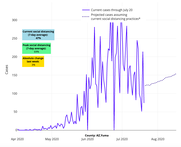
Now on to some good news. A serious commitment to social distancing in many areas of Arizona and California is starting to reverse the tide, albeit slowly. And our data shows individuals in Denver, Chicago, and New Orleans are distancing well, despite the storm clouds all around them. Even in Texas we see kernels of optimism in Austin and Waco, whose residents are figuring out that distancing, and not just masking, are the pathway to sustained mitigation.

Above are the projections for Yuma County in Arizona.
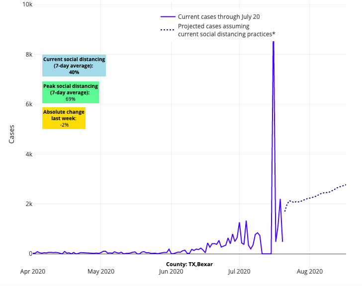
But true to its culture of individualism, the situation in Texas very much remains a mixed bag with a fragmented policy response that has allowed its epidemic to grow. Most areas continue to worsen, particularly Dallas and San Antonio. Our projections for Houston and Galveston have decelerated slightly, but their communities could still benefit from more distancing to flatten their curve.

Above are the projections for Bexar County in Texas.
Meanwhile, most of the South continues to burn, as many in these communities seem indifferent to the outcomes that are befalling them. This includes counties across Louisiana, Mississippi, Tennessee, South Carolina and North Carolina; this southern region is clearly aggravating the transmission risk for most of the country and is proof central of a failed state-to-state strategy.

Above are the projections for DeSoto County in Mississippi.
In the heartland, we see continued increased risk converging around St. Louis, Kansas City, Louisville, Wichita and Indianapolis. The Upper Midwest remains tenuous with Chicago slowly worsening, given accumulating risk around it. Denver too looks fragile this week, with similar increased transmission risk in most neighboring counties. Baltimore’s projections are substantially worse, as are those of Virginia Beach and Norfolk, Va.

Above are the projections for Baltimore County in Maryland.
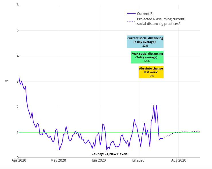
Moving north along the I-95 corridor, it’s concerning to see our forecasts for Philadelphia and its collar counties beginning to look more like those of Baltimore. New Jersey’s risk for resurgence is concentrating for the moment along the shore, as we would suspect from increased traffic during the July Fourth holiday weekend. New York City hangs in the balance with continued signs of increased risk for transmission, a trend that has made its way to New Haven, Conn., the entire state of Rhode Island, Boston and Cape Cod.

Above is the R graph for New Haven County in Connecticut.
And now onto questions a couple of frequently asked questions that our team has received lately:
1) Why do we suspect that travel corridors are responsible for virus transmission?
One of the most helpful aspects of our models is that we run them weekly, which allows our team to observe trends within counties and regions in real-time as they evolve. That allowed us to see the earliest signs of spread along travel corridors and detect confluent areas of increased transmission in suburban areas, which often precede cities and accelerate into widespread transmission. We noted early on how the Imperial County outbreak in Southern California spread up the I-10 to the I-5 before the entire state of California rapidly worsened. We saw spread along the I-85 and I-95 corridors, which continues to this day. And we were quick to observe vacation areas, such as Hilton Health Island, Virginia Beach and Galveston, Texas, worsen after Memorial Day. More recently, we’ve now seen similar patterns along I-94 originating in Detroit and affecting Ann Arbor, Battle Creek, and Kalamazoo on its path west to the counties along Lake Michigan.
2) Where are the next hotspots according to our model? 
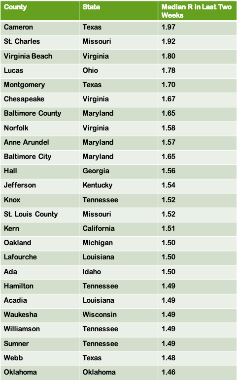
Helping us spot new patterns is an internal analysis we debuted this week, as you can see on the right, that allows us to examine the areas with the highest reproduction numbers over the last two weeks. Reproduction numbers, or Rs, estimate the number of individuals infected for every person with COVID-19. Using this analysis, we can also compare the rankings of counties week to week for consistent and worsening trends.
For example, we clearly see now that vacation spots, many which were among the most popular July Fourth destinations, are accumulating risk. In addition to the Lake Michigan shoreline, this includes Asheville, NC, lake country Minnesota, and the Virginia and Maryland shore counties of the Chesapeake Bay. Counties outside of large metropolitan areas are also increasingly on this list, as are some of our largest cities that we’ve mentioned earlier in this post.
Over the next couple of weeks, we will see if the recent responses by state leaders—late though many were—have been sufficient to begin flattening the curve again or if we will see more dominoes fall. It remains uncertain if the public will adhere to tightening restrictions, and whether these restrictions will be enforced with any reliability. These competing and opposing forces hang in the balance as we await the publication of our analysis tomorrow in JAMA Network Open on the main drivers behind the early outbreaks in 211 counties dating to late February. How much of a role does weather play? How important is social distancing for getting case counts back to a manageable level? Stay tuned for the article’s release tomorrow.
Gregory Tasian, MD, MSc, MSCE, is an associate professor of urology and epidemiology and a senior scholar in the Center for Clinical Epidemiology and Biostatistics at the University of Pennsylvania Perelman School of Medicine. He is also an attending pediatric urologist in the Division of Urology at Children's Hospital of Philadelphia.
